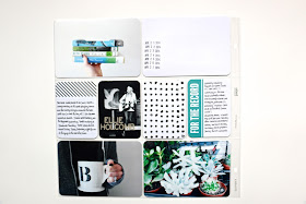
The most fun, relaxing method for creating my weekly Project Life spreads is to gather my photos at the end of every week and start creating. But, for various reasons, that hasn't been the case this month and I've had to be really intentional about setting aside time to catch up. At the end of the day (or week, if we're getting technical), as long as I have my favorite moments documented, I'm satisfied. Sometimes it's not about stretching yourself creatively or trying something fresh and new (although that's always fun when I have the time); it's really just about getting photos printed.
I added a 5x7 insert with a picture from a photoshoot on one side and a big family portrait on the other. (Didn't photograph the other side - eep!) My favorite feature is the little blue and purple watercolor card on the left side. I painted it months ago, not sure I'd ever be able to use it, but it matched the photos perfectly and managed to tie everything together. I'm definitely going to be experimenting more with creating watercolor cards in the future.
This week's spread was super simple; I think I literally finished it in ten minutes. I try to take photos with a lot of white space, so that even if I don't have a lot of time to "gussy up" a layout, at least it'll look clean and pretty. The "spring becomes her" card was actually printed from an Anthropologie catalogue - it was too cute not to cut out and use! I used a Sharpie to journal on the "Remember This" journaling card, which I wasn't too tickled about. I love writing in Sharpies on photos, but on the card it was a little much. C'est la vie. Or however you spell that.
This was my favorite spread this month. I love the consistency of the colors, which was a luck accident. Simple but fun, kind of like the actual week. And I can't get over our dorky picture together in the car - Trevor ruins all of our potentially good pictures and I kind of love it. Photographing his child will be a joy, I'm sure. (Why am I talking about kids all of a sudden? Make it stop.)
Aaaand some close ups just for funsies.
Welp. That's all, folks.


i love your project life updats - so creative!
ReplyDeletedo you print your pictures at home? if so what printer do you use? :)
I love the light and airy feel to your layouts. Even with full pocket photos, your spreads seem to have so much 'white space'. Mine always end up feeling so dark and crowded...
ReplyDeleteYour pages are gorgeous, I always love seeing them. Clean, white, crisp, pops of colour, inspirational!
ReplyDeleteI am absolutely swooning Heather! Your Project Life style is impeccable :)
ReplyDeleteI agree...gorgeous layouts! Can I ask how you photograph your PL? I can't seem to get rid of the reflection from the protector pages....
ReplyDelete